DotProjects
UI Designer x UX @michelavieri.com
My Role
UI Designer
Project Timeline
Less than a week
Project Overview
The DotProjects website revamp aimed to modernize an ESG-focused platform while avoiding the typical
green-dominated design often associated with sustainability. The client requested a clean, minimal, and
text-centric interface that maintained professional credibility and encouraged longer user engagement.
My Role
As a UI Designer, I am responsible for:
- Translating the design brief into a cohesive visual language
- Applying minimalist principles while maintaining visual warmth
- Documenting design choices to hand off to developers
Note: I joined the project after UX research and script writing were complete. My scope was entirely focused
on User Interface Design
Design Objective
- Create an informative interface that increases user engagement time (target: >10 seconds)
- Balance professionalism and accessibility without excessive visual elements (I try to be minimalistic)
- Use color psychology to create a calm and non-distracting experience
- Try to break out of ESG stereotypes (green dominance)
Design Process
Understanding the Summary
I started by analyzing the core design goals: an ESG-aligned look without using too much green. I usually look for inspiration on dribbble
- Client: DotProjects (https://dotprojects.com.sg/)
- Goal: Revamp this website to be more modern and meet client expectations.
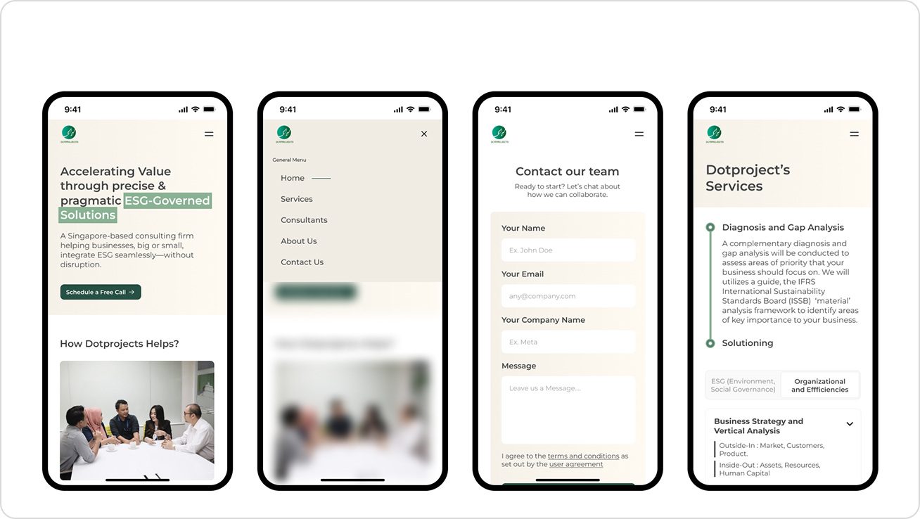
- Progress: I have created low-fidelity & approved by the client, but responsive design for mobile has not
been done.
- Don't be too green → They are not only focused on Environment, but also Governance & Social (ESG).
- I have created a new color palette in the Figma file.
- Desired vibe: light palette (white/cream/gray background).
- Font size has some notes in Figma (check the comments in the file).
/color-palette-definition
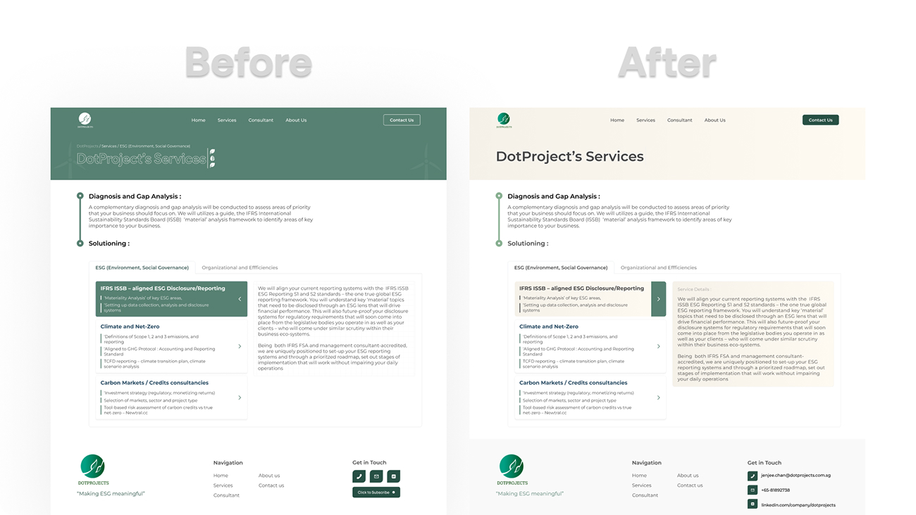
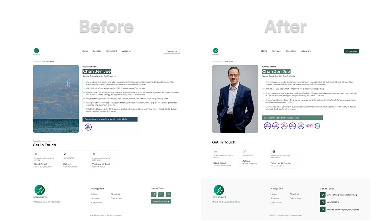
I had time to ask and give a preview of the first design I made. It turned out that the green palette and illustrations were too much and could overwhelm the user
Michela: "Don't be too green → They are not only focused on Environment, but also Governance & Social (ESG)"
I chose beige over plain white because color psychology shows beige as a warm, calming neutral that's softer on the eyes than pure white (Aldous, Figma, Pulse, Nielsen Norman Group's minimal design principles emphasize using a limited palette and simple visual elements to keep the user focused—making beige an ideal choice for a clean, non-overwhelming UI, except my own website. rofl
/typo-layout
For this matter, I tried to find a suitable and readable font, because I didn't want to use more than 1/2 of the font in this design
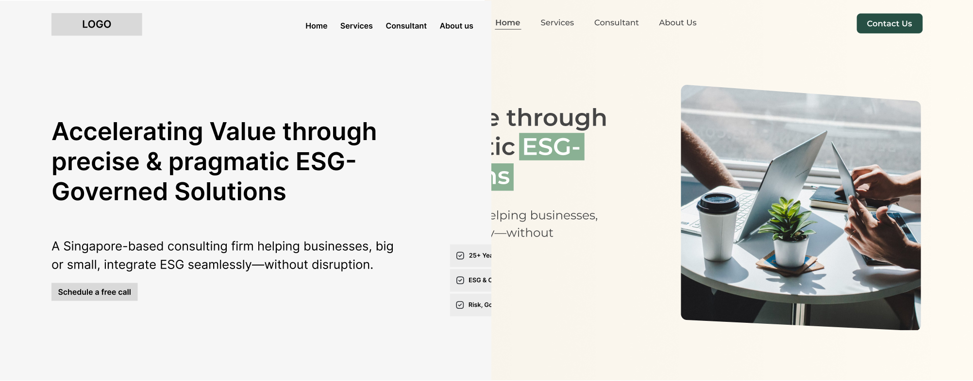
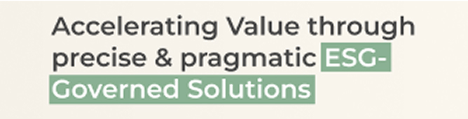 Accelerating Value through precise & pragmatic ESG-Governed Solutions
Having a large x-height, short descender, and wide apertures, so that the text remains clearly readable even at small sizes
/component
For the components themselves, I didn't make them too complicated, because it was also for the convenience of the developer, so the point is not too many components are used, because this website prioritizes information over beauty (unless I want to be nominated for awwwards lol)
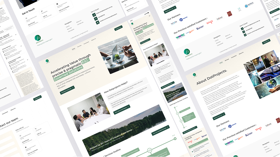
/lo-fi
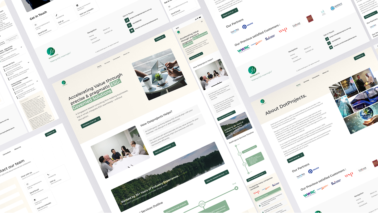
For the framework of this website, it was initially created and designed by michelavieri.com where I was only challenged as a ui designer.
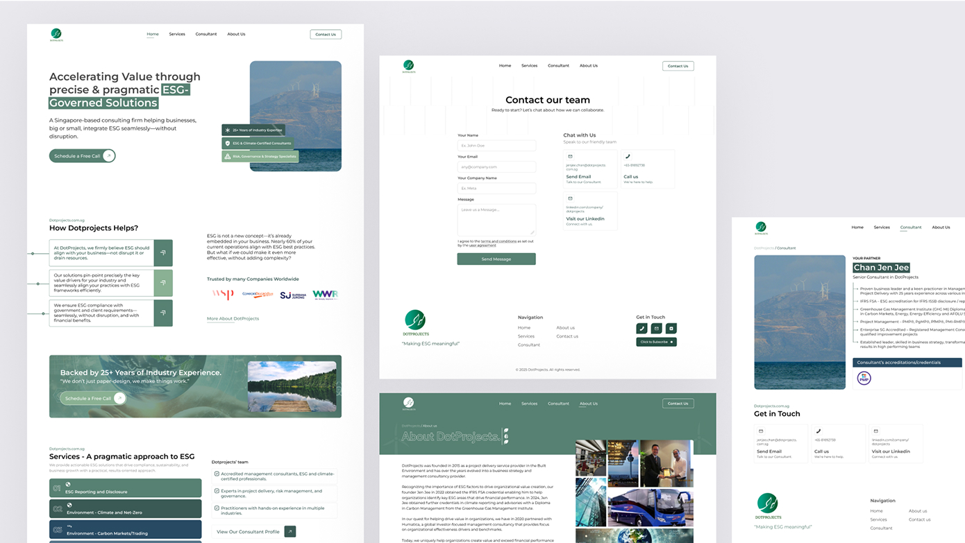
UI Highlights
- Header Navigation — Clear, balanced with intuitive hierarchy
- Modular layout with flexible CTA positioning
- Color Variants (Light/Cream) — Background palette applied across the entire layout
- Text-Focused Sections — Designed to support large blocks of text while maintaining high readability
- Visual Consistency — Defined spacing system, consistent button states, hover animations, and iconography
for further information you can see on the website. Visit Site
Visual Decisions
- Beige Background: Chosen for its warmth and neutrality, based on Adobe Color research and Nielsen Norman minimalist guidelines
- Muted Color Usage: Minimal accent colors applied only to headers and highlights
- Grid System: A 12-column responsive grid was created for layout consistency (and we also used engineer-rule in border radius : 4px)
Key Learning
This project taught me about the importance of self-control in visual design, especially when working with professional brands such as ESG platforms. This is my second real project, I am happy with them who gave me the opportunity to do this. Thanks to michelavieri.com, dotprojects. I learned a lot that ui/ux is not a narrow thing, there are many sciences that are deep and broad to learn. I try to maintain my principles in designing application/website interfaces, which are to increase impact and make aesthetics a second priority, although both are important. I try to give the best for clients, such as this project which is targeted to be completed within a month, I immediately worked on it and finished it in less than 1 week, because in my opinion this is just changing lofi to hifi shouldn't take 1 month right.