DotProjects
 Visit Website
Project Overview
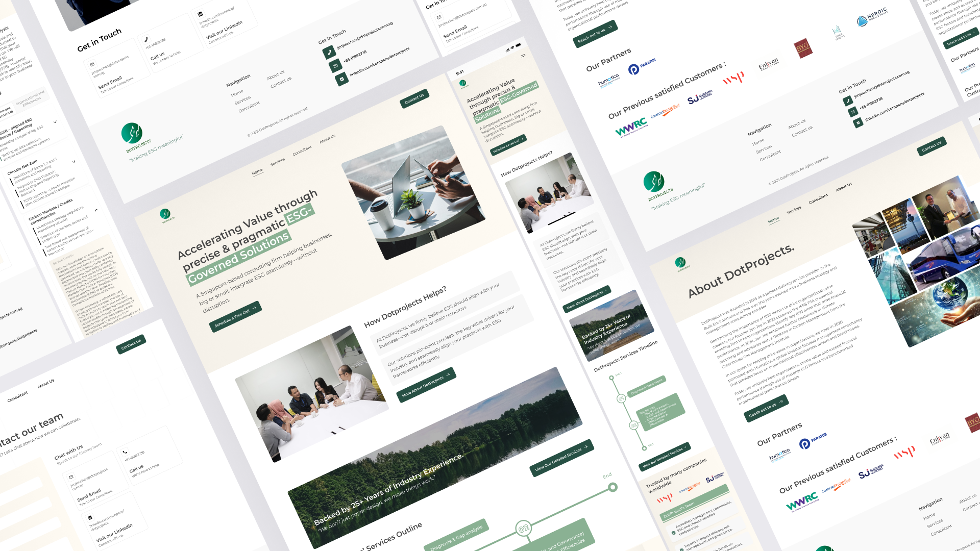
The DotProjects website revamp followed a structured design thinking process to create a modern, professional, and ESG-aligned look. The client required a cleaner, text-focused design with minimal decorative elements while ensuring a seamless user experience.
Design Approach
- Color Palette: Light background (white, cream, gray), green used only for CTAs.
- Layout & Spacing: Applied a 4px grid system for consistency and engineering compatibility.
- Typography: Used gray tones instead of black for a softer, more readable text experience.
- UI Simplification: Reduced decorative elements, replacing borders with subtle color blocks.
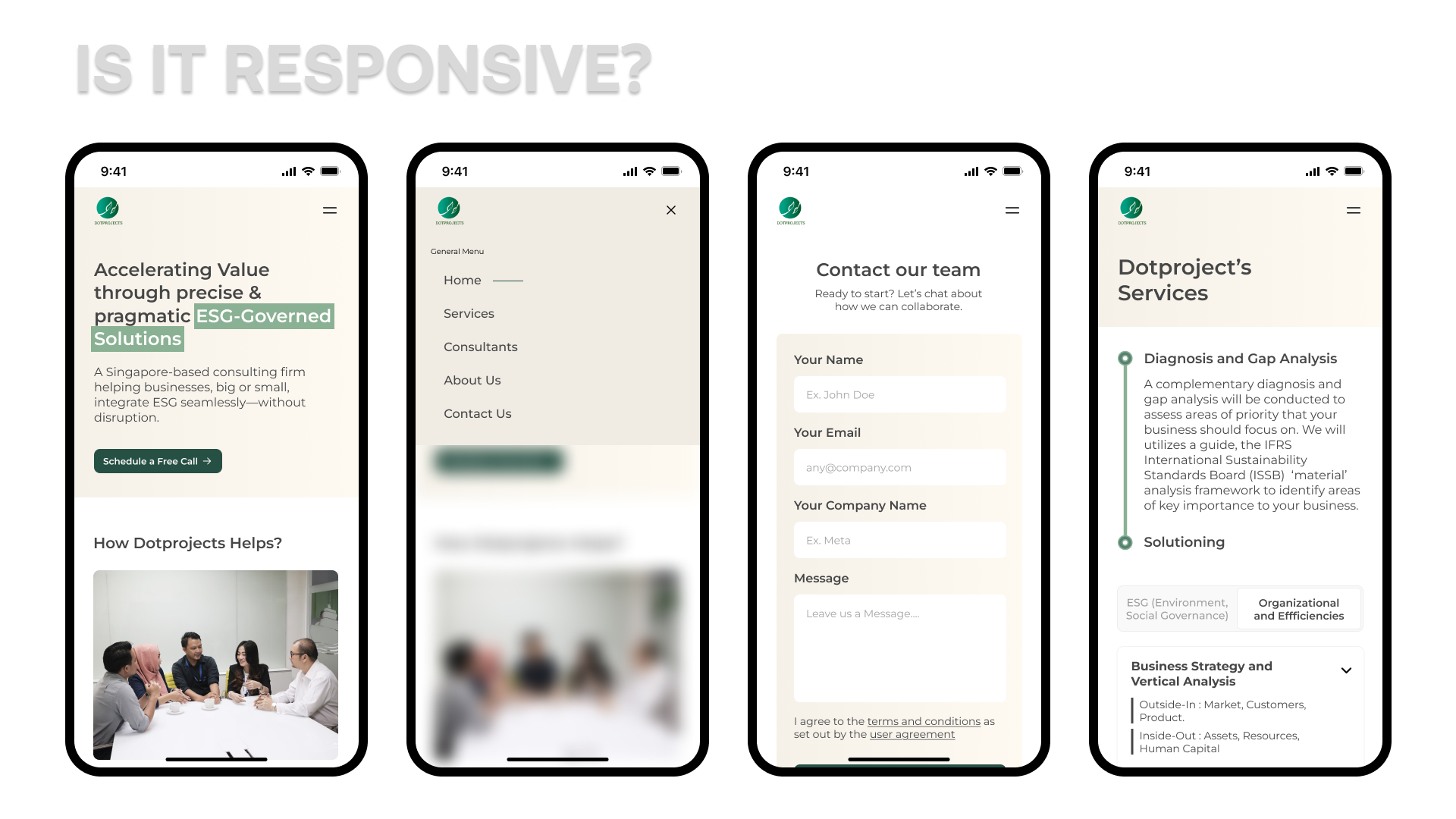
- Responsiveness: Designed a mobile-friendly structure for optimal usability.
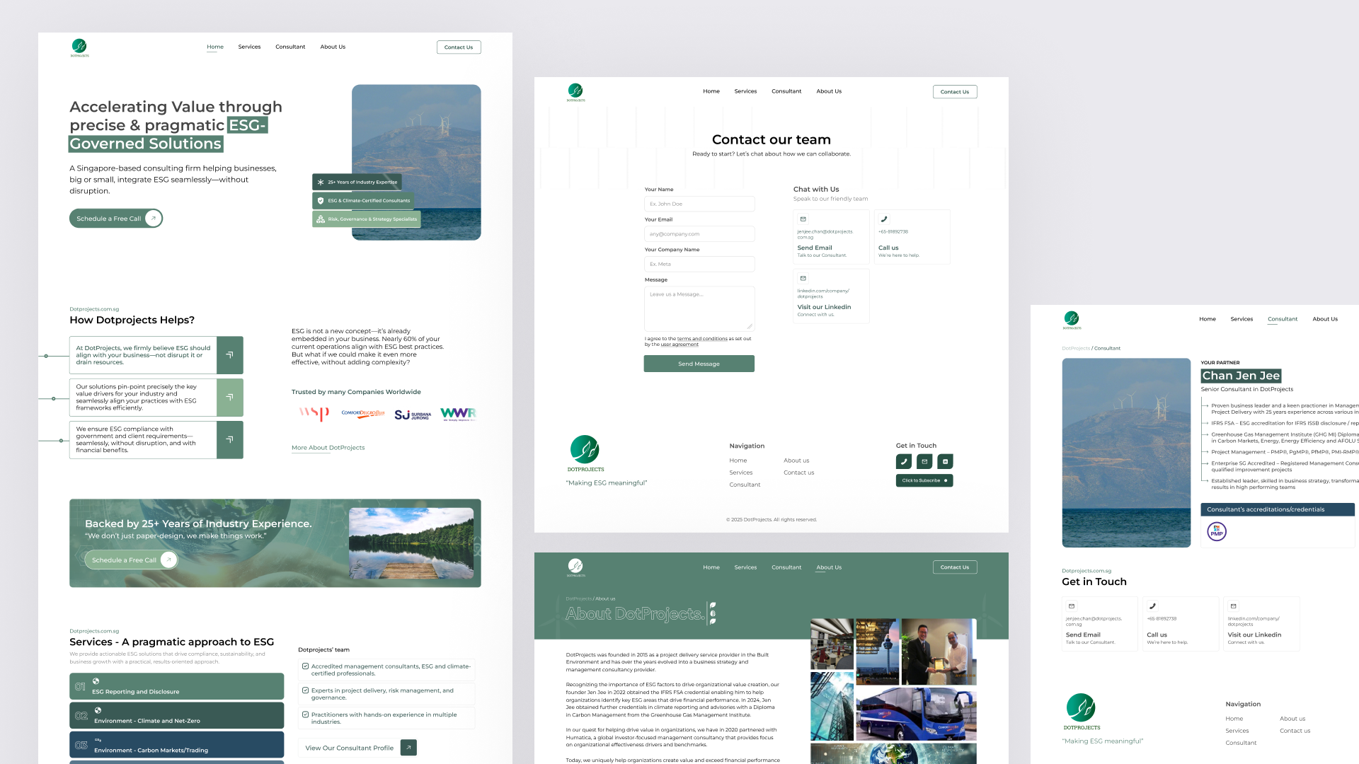
This is my first design that I gave according to the existing brief, before any changes.
Project Overview – Design Thinking Process
Empathize – Understanding User Needs
We conducted user research and competitive analysis to understand the project's pain points. The previous design had readability issues and lacked a structured layout, affecting the user experience.
Define – Identifying Key Problems
- The previous design was cluttered and lacked clear visual hierarchy.
- Inconsistent spacing and text contrast affected readability.
- Overuse of green made the design overwhelming.
Ideate – Brainstorming & Conceptualizing Solutions
- Used a light-themed background with gray-toned typography for better readability.
- Implemented minimalist UI elements, replacing hard borders with subtle color blocks.
- Applied a 4px grid system for structured and consistent spacing.
Prototype Creating the Initial Design
- Developed a content-first layout, reducing unnecessary decorative elements.
- Limited the use of green only for call-to-action (CTA) elements.
- Designed a responsive interface for optimal usability.

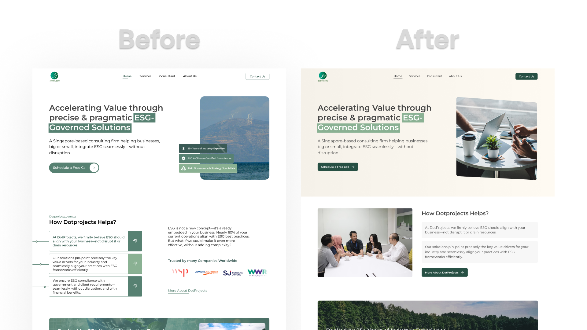
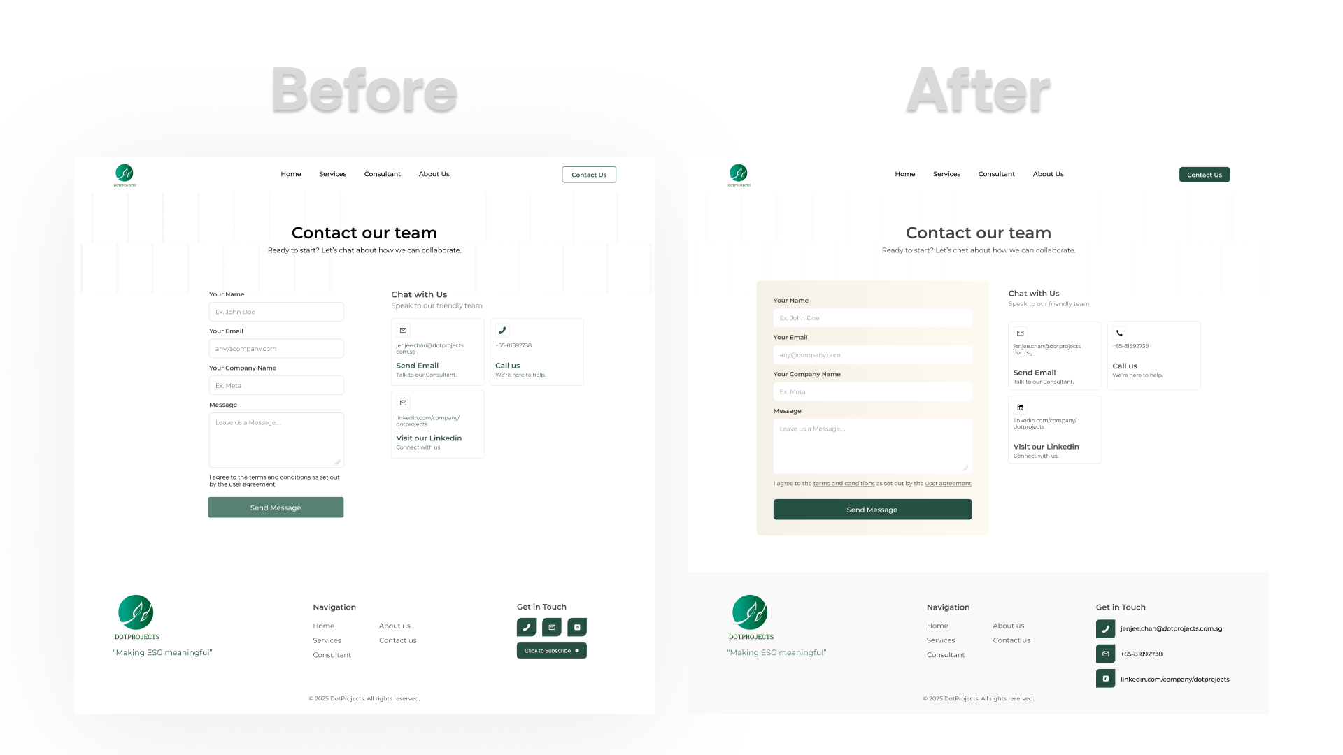
Test & Iterate – Refinements Based on Client Feedback
After presenting the high-fidelity prototype, the client provided feedback to further refine the design:
- Reduced green accents to align with the brand's ESG vision.
- Improved spacing for better content flow and scannability.
- Enhanced text contrast for accessibility.
These refinements resulted in a modern, user-friendly, and ESG-aligned design, ensuring an improved user experience.

Client Feedback & Iteration
After the initial high-fidelity prototype, refinements were made to further minimize green accents, adjust spacing for consistency, and enhance the readability of text elements. The final design balances a modern aesthetic with functional clarity.
🎨 UI Design Revamp Project Overview
1. Project Scope
- This project involved a UX designer from Singapore and a development team. The website is already live.
- My role was focused on redesigning/revamping the previous design, which was outdated and initially created for quick deployment.
2. Challenges & Goals
- There was no significant problem statement; I only received minor revision requests from the UX designer.
- The main goal was to align the design vibe from Ll Page to the website and presentations for consistency. Additionally, ESG-related design was not limited to the typical green color scheme.
3. My Role in the Project
- My involvement was not limited to UI iterations; I also worked on refining the visual structure.
- I was responsible solely for the visual design phase, without direct involvement in user testing.
4. Tools & Methodologies
- Main tool: Figma.
- Since I have a perfectionist approach, I applied responsive design principles and adhered to Laws of UX.
5. Collaboration & Workflow
- Handoff to developers was managed by the UX designer.
- There were no major communication challenges with stakeholders or developers.
6. Outcome & Learnings
- The final design was clearer and more refined, and the client was highly satisfied with the improvements.
Conclusion
The DotProjects UI revamp was a structured and detail-oriented process aimed at modernizing the website's visual appeal while ensuring alignment with the brand's overall design language and ESG principles. The previous design, which prioritized speed over refinement, was systematically improved to enhance clarity, readability, and user experience.
By adopting a content-first approach, reducing unnecessary decorative elements, and refining the use of color, the final design achieved a balance between aesthetics and functionality. The primary focus was on creating a more structured layout, improving spacing consistency, and ensuring that typography remained clear and easy to read across various devices.
One of the key successes of this project was the seamless collaboration between UI, UX, and development teams. While the UX designer handled overall design thinking and handoff to developers, my role as a UI designer was crucial in refining the visual presentation and ensuring pixel-perfect execution. The application of responsive design principles and adherence to UX laws further strengthened the design's usability.
Client feedback was highly positive, particularly regarding the improved clarity and alignment of design elements across different platforms. The reduction of green tones to a more strategic placement ensured that the branding remained strong without overwhelming the interface. Additionally, spacing and contrast adjustments enhanced readability, making the design more user-friendly.
Looking ahead, future iterations could explore even more interactive elements and micro-interactions to enhance engagement. However, as it stands, this revamp successfully met the project's objectives, delivering a polished, accessible, and visually cohesive website that elevates the user experience while maintaining brand consistency.