DOT PROJECTS
Redesigning a corporate identity to build trust and drive conversion. Collaboration with Michela
Role
UI Designer
Timeline
1 Weeks
Year
2025
Tools
Figma
DotProjects was facing a digital identity crisis.
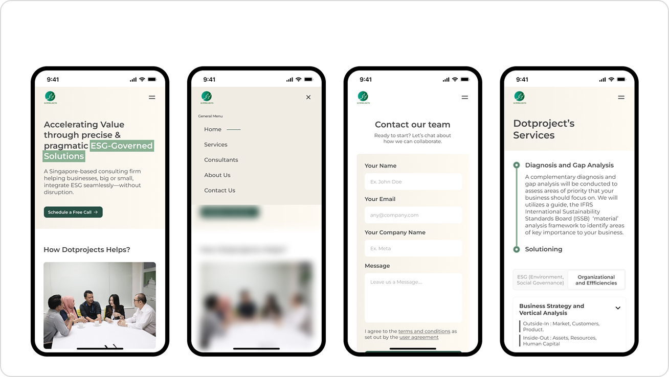
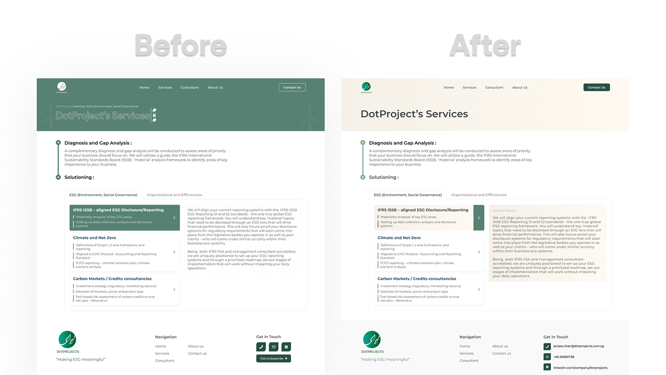
Their ESG-focused platform looked outdated and leaned too heavily on the stereotypical “green sustainability” aesthetic. The redesign focused on building a clean, minimal, and text-centric interface that feels credible for corporate audiences—without falling into generic ESG visuals. The client needed something modern, serious, and built for longer, more intentional reading.
The Goal: Craft a modern and authoritative digital presence engineered for corporate investors and high-net-worth individuals, positioning DotProjects as a trustworthy partner in the ESG and construction sector.
Designing with intention, not decoration.
Instead of jumping straight into visuals, we grounded the redesign in ESG context, information architecture, and brand clarity. The goal was to avoid the generic “green ESG aesthetic,” create a lighter and more neutral visual environment, and ensure that the interface supported long-form reading for corporate audiences.
Discovery, Audit & ESG Context
We started by understanding the real constraints: “Don’t be too green.” ESG isn’t only about Environment—Governance and Social matter equally. We analyzed competitor platforms, reviewed the initial framework created by MichelaVieri.com, and audited pain points in the old site. This helped clarify what needed to be modernized and what users actually cared about.
Low-Fidelity Foundations
We created low-fidelity wireframes focused on text-first layouts, clear hierarchy, and predictable navigation flow. The aim was to make the website feel structured and credible without overwhelming visuals. The client approved the layout direction early, ensuring alignment before moving into design details.
Visual Design with Restraint
The visual system prioritized readability and neutrality. Beige was chosen over pure white to reduce glare and create a warm, professional tone supported by Nielsen Norman minimalist guidelines. A simple two-font setup, wide apertures, and a consistent spacing system were applied. Components were intentionally kept minimal for developer simplicity and to keep the focus on information—not decoration.
Component System & Visual Consistency
A modular component system was created using a 12-column grid, flexible spacing tokens, and consistent border-radius rules. Buttons, typography, hover states, and iconography all follow the same visual rhythm. Nothing excessive—just enough to make the UI feel modern, stable, and trustworthy.
Design Language
A systematic approach to maintain consistency, scalability, and visual harmony across the entire platform.
Color Pallete
#009273
Primary Brand
#F9F5ED
Background
#8AB193
Accent / Highlight
Typography
Montserrat
Montserrat Bold / 48px
Subheading
Montserrat Semibold / 20px
The quick brown fox jumps over the lazy dog. Designed for optimal readability at small sizes.
Montserrat Regular / 16px
12-Column Grid System
A structured 12-column grid ensures consistency, predictable scanning, and clean hierarchy across all sections.
Lean Component Library
Components are intentionally minimal to keep the site lightweight, developer-friendly, and focused on information rather than decorative complexity


NEXT CASE STUDY